Repository navigation
UI Themes
mini2Dx-ui comes with a pre-built theme named default-mdx-theme based on Kenney's UI Pack. However you can easily create your own themes.
First, you'll need to create a packed TextureAtlas using the Texture Pack Tool. You can see the default theme's textures unpacked here and post-packing here.
Themes are defined in JSON that declare the visual styling of different elements. The default theme's JSON file can be viewed here. Each style has an ID to identify it that be set on UiElements using setStyleId. To ensure no UI errors, there must be a style id named "default" for all elements.
The following is an example of the default style for images taken from default-mdx-theme.json
  "images": {
    "default": {
      "rules": {
        "XS": {
          "paddingTop": 0,
          "paddingBottom": 0,
          "paddingLeft": 0,
          "paddingRight": 0,
          "marginTop": 0,
          "marginBottom": 0,
          "marginLeft": 0,
          "marginRight": 0
        }
      }
    }
  },
As seen above, it is possible to change the style based on the ScreenSize (XS, SM, etc.).
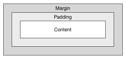
All UiElements are based on a box model similar to CSS box models.
- Margin pushes the box size outwards/inwards.
- Padding pushes the content inwards.